Edited / Case study
Edited Main Menu
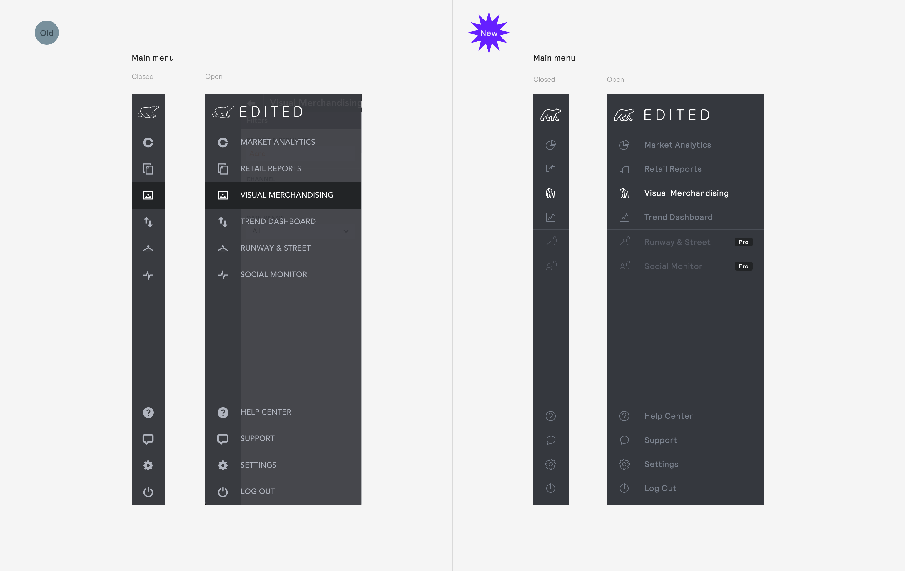
An application can often be significantly hampered by a poor menu design or implementation. Thankfully our Menu component was relatively well implemented and we had plenty of users happily using the product with little to no issues with navigating to each section of the application.
It should be noted, this didn't support SubMenuItems, however at the time this wasn't part of our product roadmap. There were, however, some issues that needed addressing.
Menu component

Issues
Transparency causes unpredictable legibility
Icons display unpredictably as they’re not aligned to pixel grid
No support for product segmentation (subscription tariffs)
Contrast between selected/unselected copy isn’t great enough
Improvements
Solid colour makes component predictable & easy to test
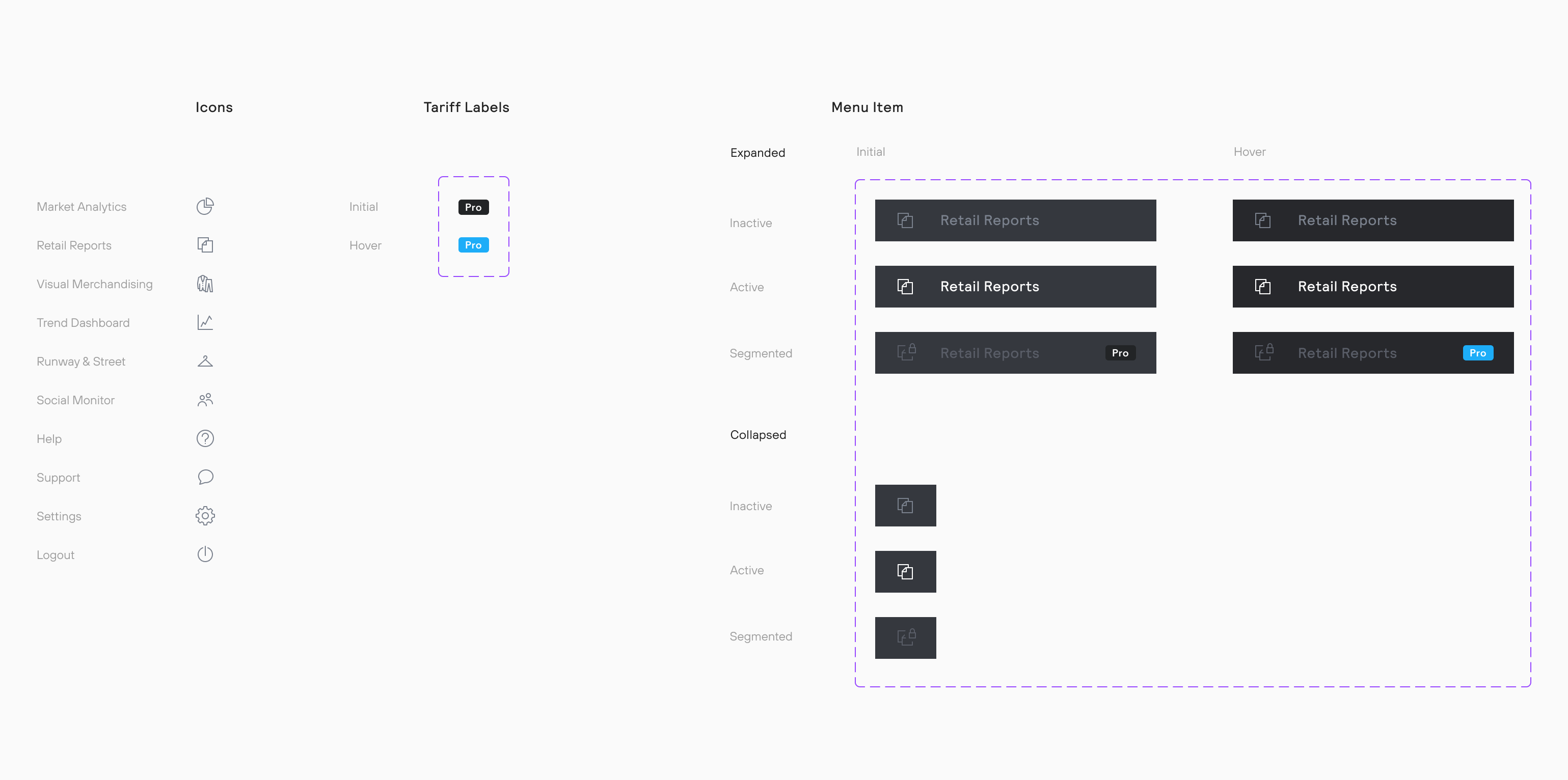
Icons improved to lessen anti-aliasing and allow for more detail
Supports product segmentation
How was it made?

We previously didn't use any componentisation in the design team. When I joined I changed that firstly with the use of symbols in Sketch and later (by the time we got to this project) components in Figma. These atoms combined together to create the Menu component variants you can see in two different states in section at the top of the page.


