Edited / Case study
Edited Filter Panel
Background
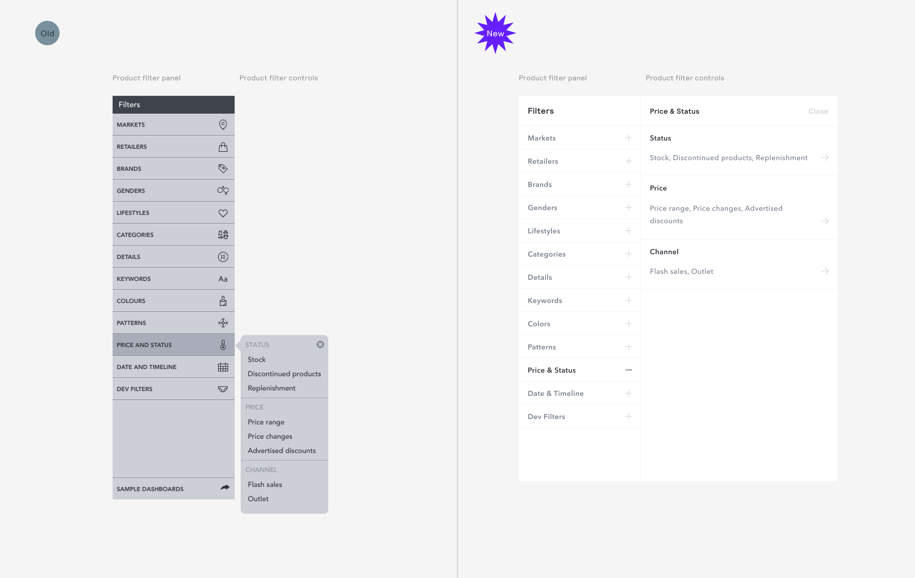
The main way users interact with Edited's Market Analytics software is by using a highly detailed filter panel to deal with finding relevent assortments of products from billions of SKUs. It is then, one of the most important features within the application and a major touch point.
When I arrived it was clear that it needed some work to reduce some confusion we were seeing within user cohorts and also to reduce our component variants and cost overhead of maintaining so many components.
Product filter panel
Issues
Users are unclear they can click the sections to initiate filtering.
Popover location is highly unpredictable and moving mouse into the
ControlPaneldrilldown is fiddly and can cause mouseleave events to trigger.Stylistically feels dated and heavy and distracts from the content users are interested in (products and data analysis)
Multi level
ControlPanels break on smaller width screens.Inconsistent styling and placement of controls in filter panel drilldowns.
Improvements
Plus icon is recognised by users more universally in testing with nearly all identifying where to add filters
Thanks to the use of the new
Breadcrumbs, context is contained within the drilldown, meaning multi level menus can be encapsulated without the need to show the parent item.Width and placement of
ControlPanels are predictable and easier to interact with.
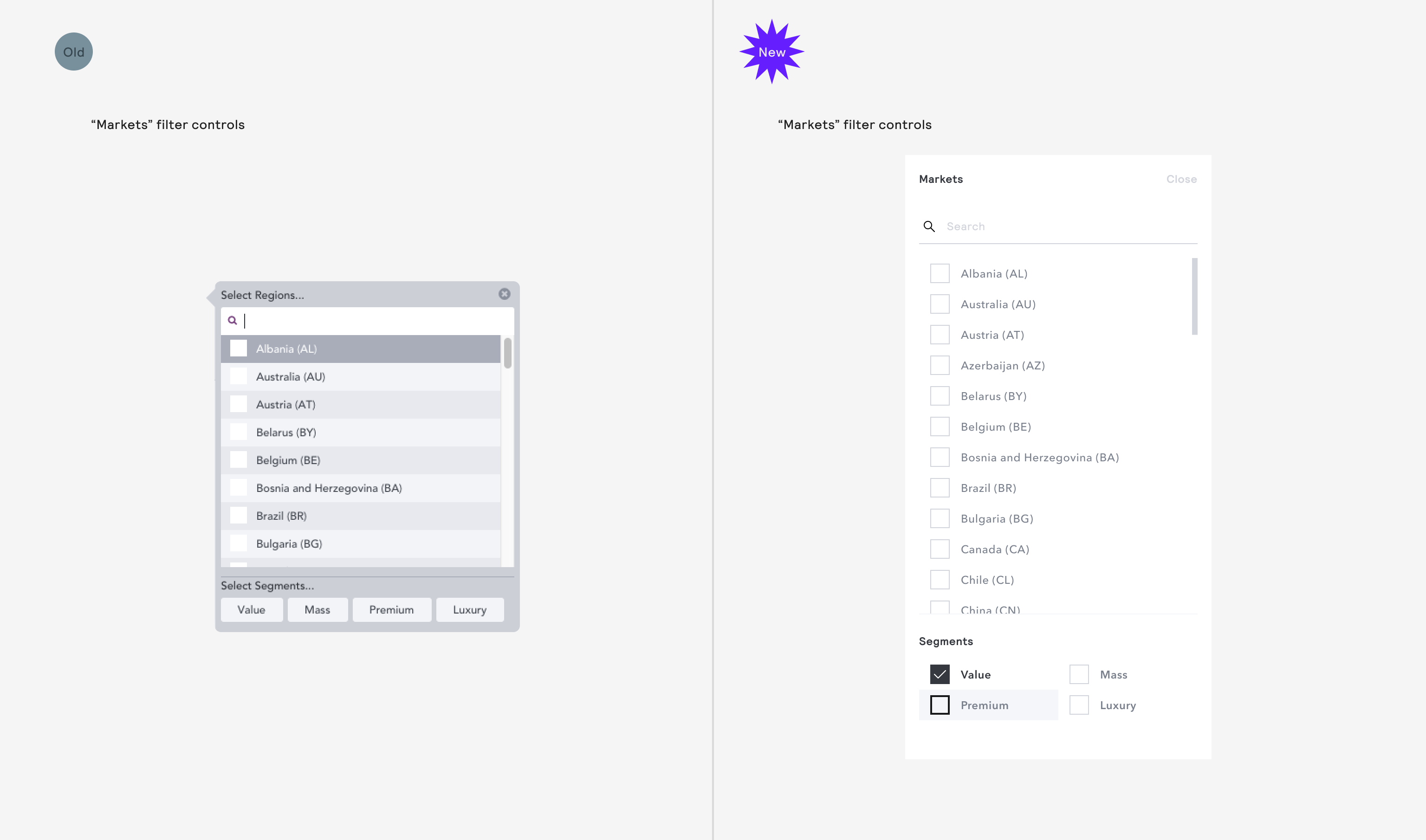
Markets filter control
Issues
Segment selection performed very poorly in user testing. Very few users could correctly describe what the segment filter would do when clicking on the buttons. It was unclear that it was a multi-select filter that was
ANDing with the market filters above.MultiSelectButtoncomponents were just one of over five unique multi-select components we were maintaining - an unjustified ongoing cost to the product.
Improvements
Utilising the tried and test checkbox pattern resulted in a better understanding from users and a more predictable interface.
We reduced the need to support
CheckboxButtonas a component and all the accessibility complexities it brought with it.
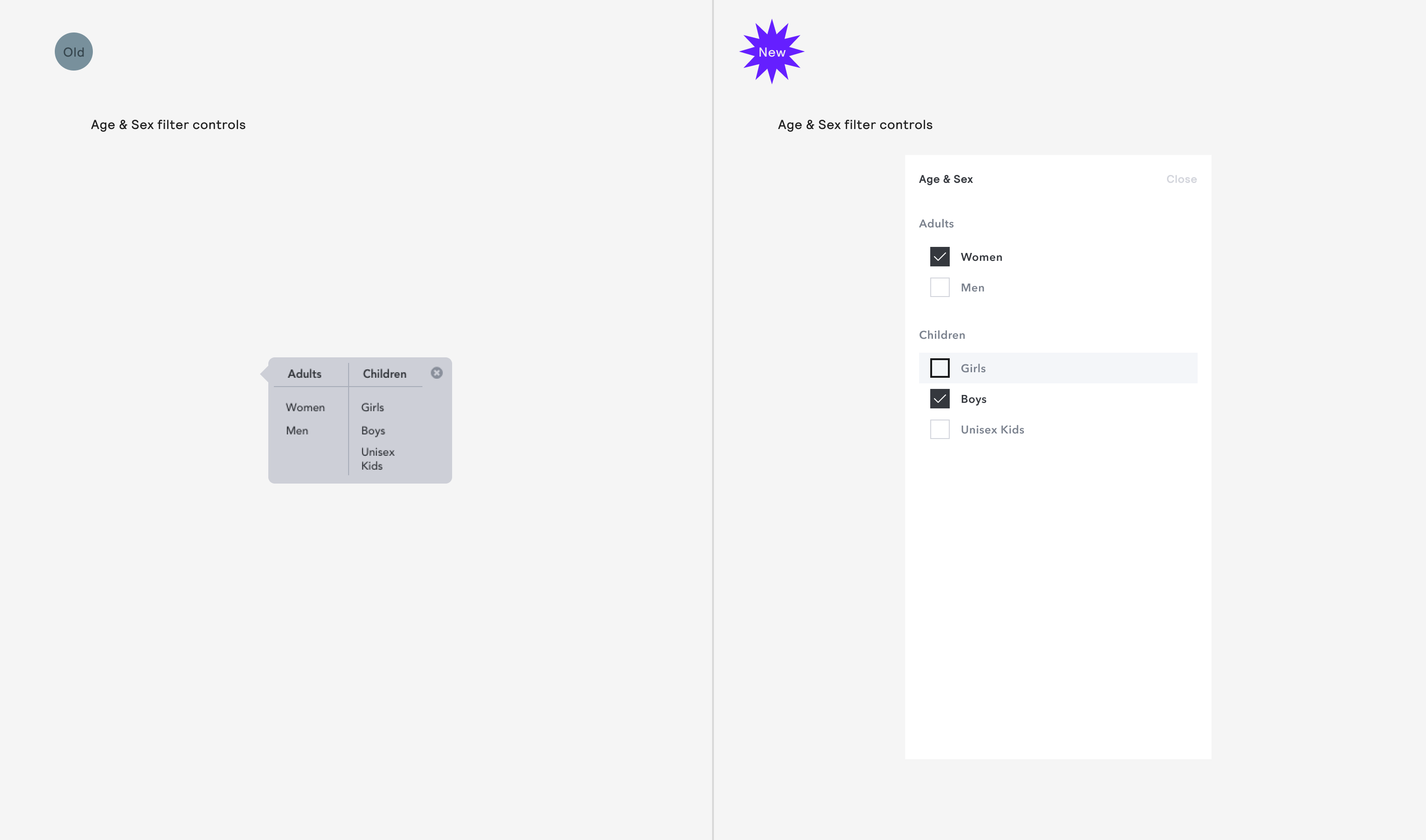
Age & Sex filter control
Issues
Users were sometimes unclear that the items were selectable.
Another multi-select component to maintain.
No titling on
FilterControl, so it requires referencing the parentFilterPanelItemthat the drilldown originates from to understand the context making reading patterns more complex.
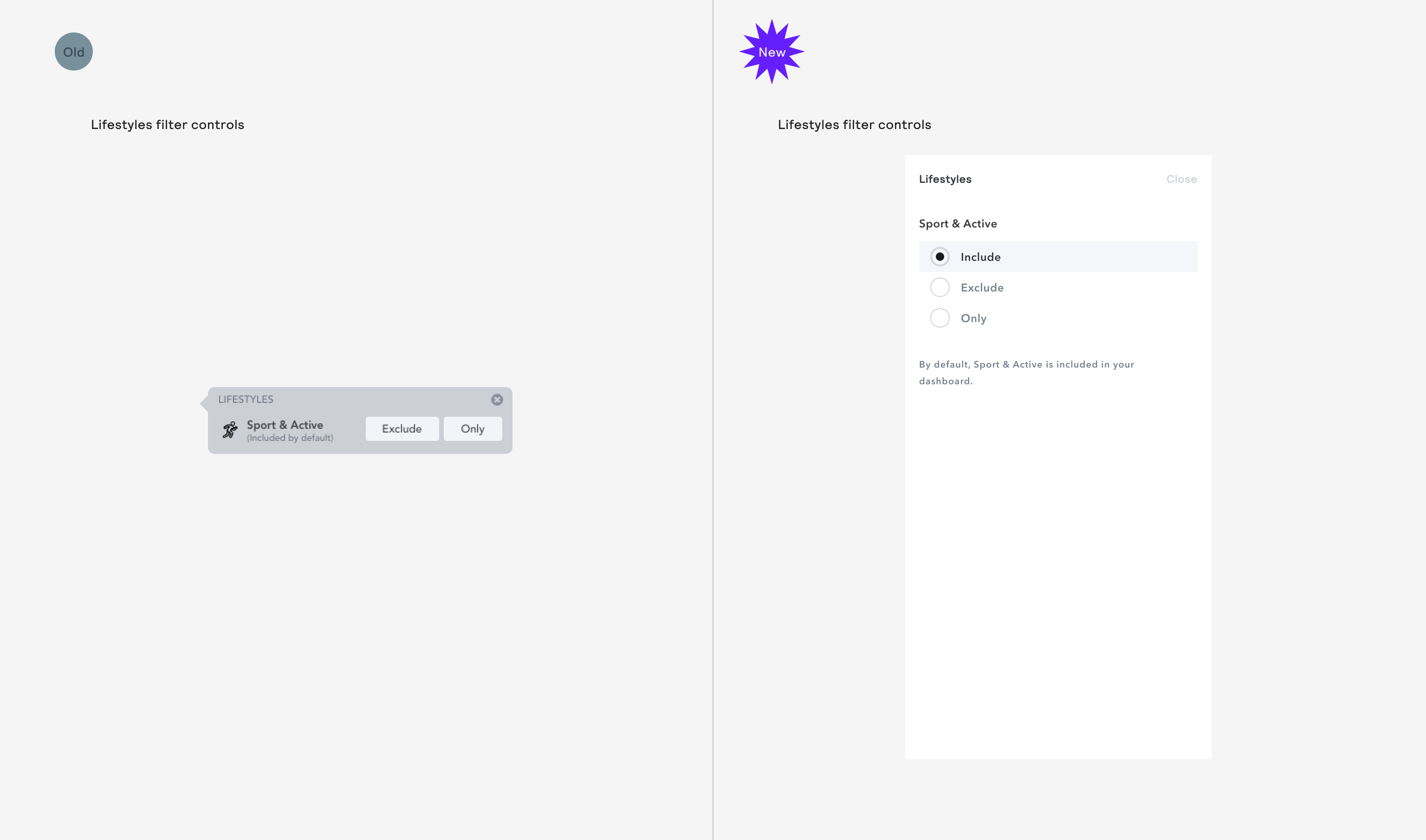
Lifestyles filter control
Issues
Users weren't clear that the item was included by default so we the issues was previously solved by adding copy to explain
It wasn't clear that "re-clicking" the button would unset the filter to "include"
There was internal arguments about whether it was correct to highlight the default state when we didn't have an "all" state in other filter panels, so we tested.
Improvements
Adding the radio button improved the understand our users had of the item being included
We ended up testing another version with a "clear" button that could then be reused across other filter panels, like multi selects, etc. This also performed about as well (though is less traditional) and we eventually switched out to using that.
Keywords filter control
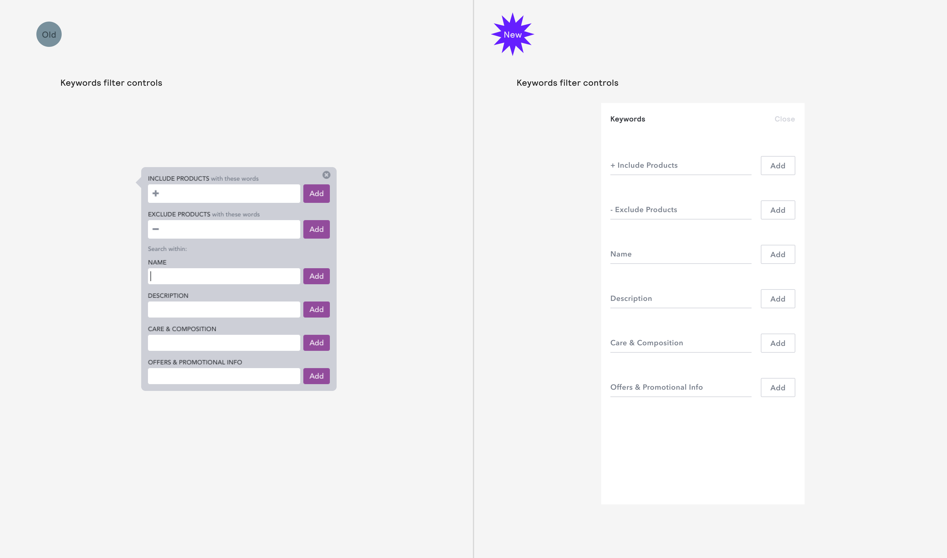
Issues
Visual noise could be reduced by utilising the label inside TextFieldInput when it’s empty.
Color filter control
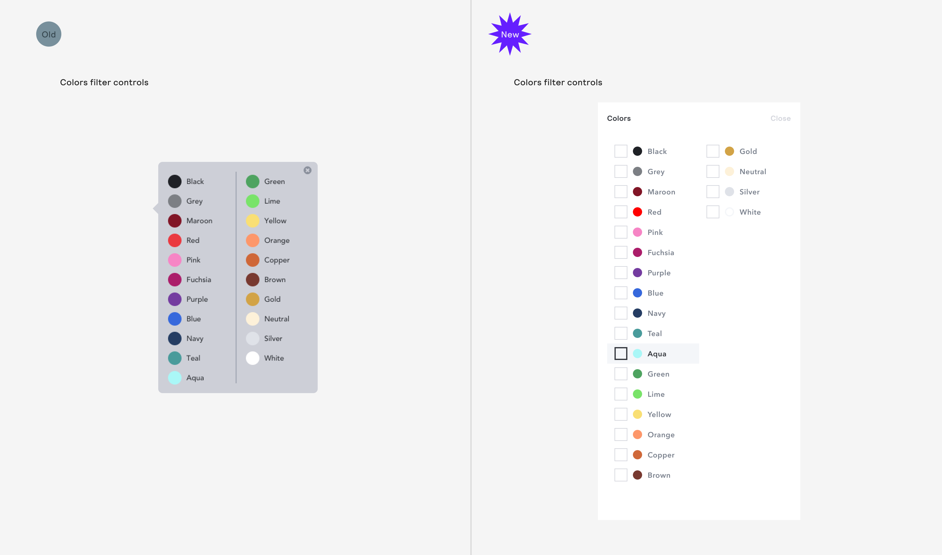
Issues
Users were sometimes unclear that the items were selectable.
Another multi-select component to maintain.
Patterns filter controls
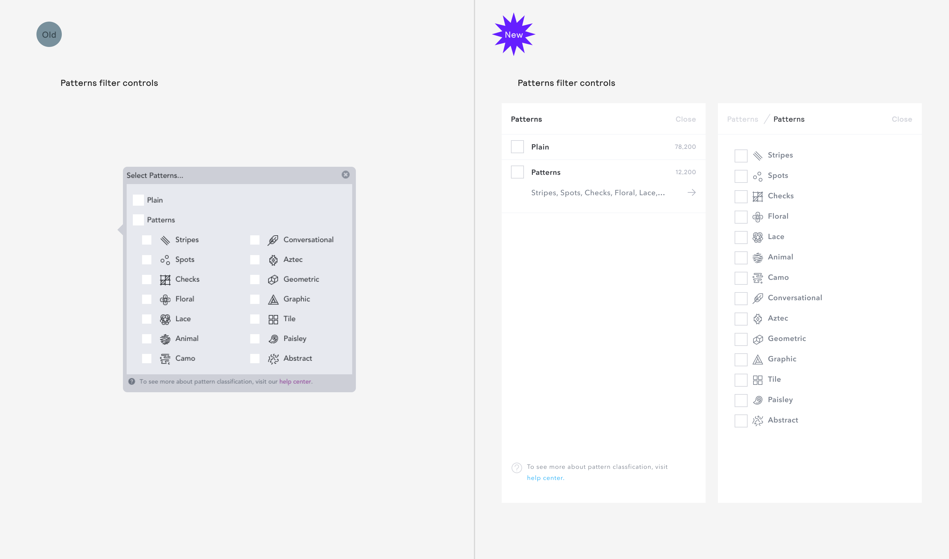
Issues
Nested multi-selects didn't scale well and we were using a new pattern to fix that in another filter so we needed to utilise the same pattern here.
Two columns made the content harder to scan and also made the width of the
ControlPaneltake up nearly all the screen on smaller laptop devices, meaning visual feedback on the filtered product results was hampered.
Improvements
We built an infinitely scalable UX pattern that allowed for any level of nesting under a parent category, which was becoming more of a problem as our neural nets and categorisers were becoming better and better at picking up product nuances.
We allowed the majority of our users who weren't interested in filtering by individual pattern types a less cluttered, confusing experience in the majority case, whilst making the selection of patterns easier.
The reduced width of the filter control panel meant more product results could be see whilst filtering. Meaning users were able to more accurately assess the quality of the results without needing to close the panel and re-find their place.

